Squeak 3.2 release - Some minor look and feel proposals
Last updated at 5:18 pm UTC on 16 January 2006
The idea behind this page is to collect some proposals for improve the 'initial feeling' with Squeak.
List of proposals
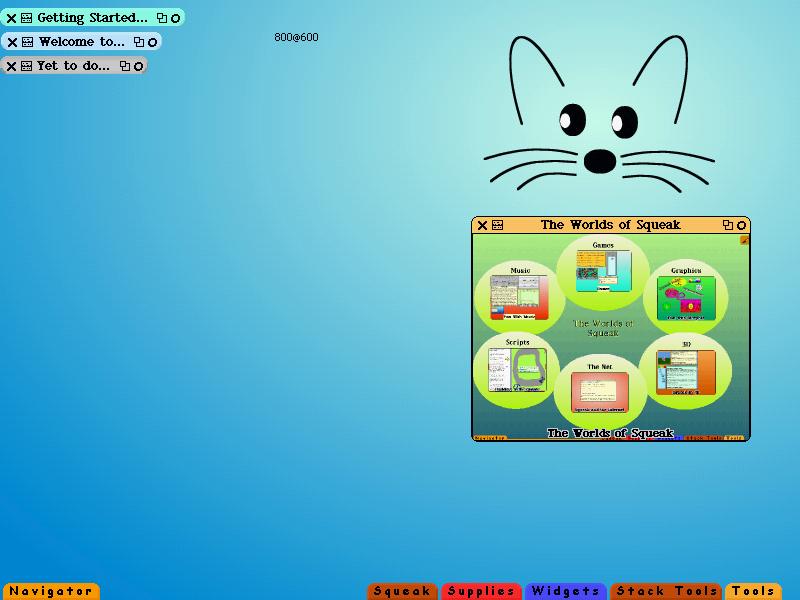
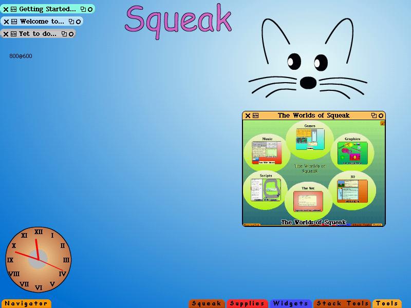
- I propose to use other background color than gray. I think that a radial-gradient with the SqueakLogo as a 'source of light' is a funny and simple way to improve the initial perception of Squeak. (dgd)
- Makes sense unless you're trying to work out of the box with 8-bit color depths (where the radial will look pretty ugly). (nk)
- Use menuColorFromWorld (dgd)
- Put a few (only 2 or 3) morphs in first screen - see the third screenshot (dgd)
- Though it may not be obvious what the two title bar icons at the right of the collapsed windows do (I think the X may be self-explanatory, but am not sure) (nk)
- take the = and X out of the windows title bar and replace it with something nicer (see image below), also change the icon for the window menu
- I've (nk) been wanting to do a minor edit of my thumbtack icon to remove the white pixels anyway; however, we'd need to agree on other icons for the title bars.