Squeak
  links to this page:    
View this PageEdit this PageUploads to this PageHistory of this PageTop of the SwikiRecent ChangesSearch the SwikiHelp Guide
WavyLines
Last updated at 1:13 am UTC on 17 January 2006
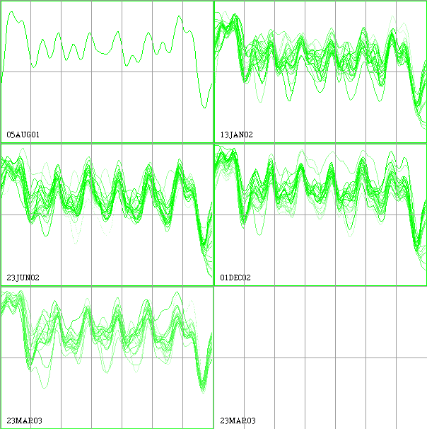
Here is a plot of utilization on the Y axis by hour of the week on the X axis. There are 7 vertical grid areas that divide the days of the week. The animation cycles through 86 weeks of data with the most recent week, noted at the bottom, being the strongest color and the previous weeks gradually fading to the background.

Uploaded Image: utilAnim.gif

The animated GIF file is just under 1 MB. This particular animation is about 50% of the linear dimensions of the original to reduce its file size.

This animation is one of many that were created using a "visual data analysis workbench" written in Squeak. It was built specifically for a particular analysis, but it wouldn't take a lot of work to generalize it a bit to work with other 3D data. Thanks to Bert Freudenberg for providing a changeset that enabled me to write out animated GIFs!

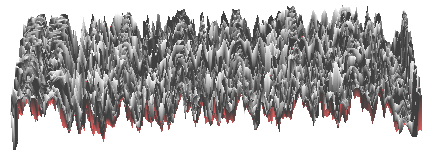
This 3D view of this same data was done with Balloon3D in Squeak, but proved to be less usefull for the analysis. This is the shag carpet view. The data here was not smoothed, where the animations were.

Uploaded Image: util3.gif

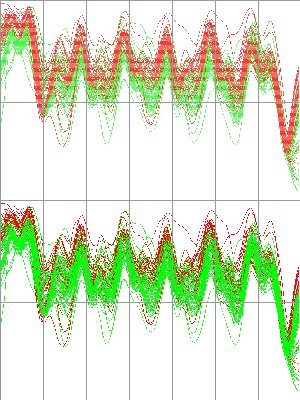
Here is the same data as above, viewed all at once, with a color change at a particular week. Two frames are slowly animated with the different colored data changing which set is in front of the other. Did you catch the upward shift noticable here when you watched the animation above?

Uploaded Image: utilAnim2.gif

See also:
Gallery of Data Visualization http://www.math.yorku.ca/SCS/Gallery/noframes.html
Cluster and Calendar based Visualization of Time Series Data http://www.win.tue.nl/~vanwijk/clv.pdf
Snap-Together Visualization http://snap.cs.vt.edu/
ViSta, the Visual Statistics System http://forrest.psych.unc.edu/research/index.html
Polaris, Interactive Database Visualization http://graphics.stanford.edu/projects/polaris/
WEKA Data Mining and Machine Learning http://sourceforge.net/projects/weka/
CoMotion (commercial service/product)http://www.mayaviz.com/web/

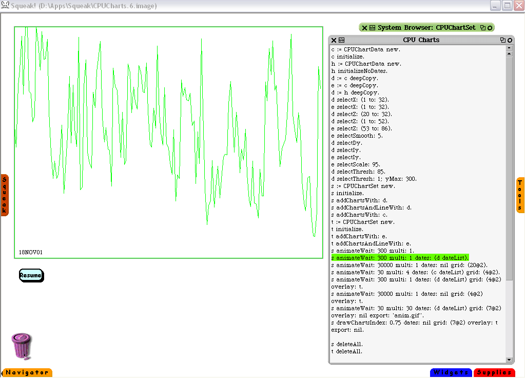
Here is a screenshot of the workbench in action. It's really simple at this point. I just select a statement in the workspace on the right and press ctl-d to do-it. Or I may change the statement a bit and then do-it. The most commonly used statements end up being retained (manually) in the workspace, but it seems to keep growing. The statements and the code structure behind them are grouped like this:

  1. Importing a set of data
  2. Filtering a set of data
  3. Building a set of charts from a set of data
  4. Animating the display of one or two sets of charts

Uploaded Image: ScreenShot.gif

WavyLines